

Table of Contents
TogglePicking a color scheme for your home can feel overwhelming, too many options, too much risk of clashing paint cans and mismatched accent walls. But there’s a proven approach that takes the guesswork out of color coordination: the triadic color scheme. Instead of playing it safe with neutrals, a triadic palette gives you permission to be bold while keeping everything visually balanced. It’s the science behind those magazine-worthy rooms where color feels intentional, not chaotic. Whether you’re refreshing a single room or planning a full home makeover, understanding how triadic colors work is the foundation for making smart, confident design choices that’ll hold up beyond this year’s trend cycle.
Key Takeaways
- A triadic color scheme uses three colors spaced exactly 120 degrees apart on the color wheel, creating inherent balance and visual interest without overwhelming the space.
- Triadic color schemes work because they naturally distribute visual energy across three hues, hitting a sweet spot between the drama of complementary palettes and the simplicity of monochromatic designs.
- Apply the 60-30-10 rule when implementing triadic colors: use your dominant color for 60% of the room, secondary color for 30%, and tertiary accent color for just 10% to prevent the space from feeling too busy.
- Test triadic color choices by painting large swatches on different walls and observing them under both natural and artificial light before committing to a full paint project.
- Kitchens and bathrooms require restraint with triadic palettes—use neutral walls and introduce triadic colors through fixtures, hardware, tiles, and accessories rather than all-over wall color.
- Bedrooms benefit most from softer, tinted-down versions of triadic colors to promote calm without overstimulation while maintaining visual sophistication.
What Is a Triadic Color Scheme?
A triadic color scheme uses three colors equally spaced on the color wheel, exactly 120 degrees apart. Pick any color, skip two, grab the next one: repeat that pattern twice more, and you’ve got your trio. Common examples include red, yellow, and blue: or orange, green, and purple. The key to understanding triadic schemes is that they’re inherently balanced. Each color gets equal visual weight when used intentionally, and because they’re far apart on the wheel, they naturally contrast without clashing when applied with restraint.
Think of triadic colors as a built-in harmony system. Unlike complementary schemes (which use just two opposites) or split-complementary ones (which use one color plus two neighbors of its opposite), triadic gives you more flexibility and more visual interest. You’re not limited to two colors fighting for attention, instead, three distinct hues support each other.
How Triadic Schemes Differ From Other Color Palettes
Triadic schemes stand apart because they create dynamic balance without being overwhelming. A monochromatic palette uses shades and tints of one hue, safe, cohesive, but sometimes flat. An analogous scheme (colors next to each other on the wheel) feels harmonious and calm but can blur together if you’re not careful with value contrast. Complementary schemes (opposites on the wheel) deliver maximum drama but can feel aggressive in large doses.
Triadic colors? They hit a sweet spot. You get the drama and visual interest of complementary pairs, but distributed across three players instead of two, which spreads the visual energy and prevents any single wall or piece of furniture from visually dominating the room. The color wheel chart provides a quick reference for locating these 120-degree relationships without second-guessing yourself.
Why Triadic Colors Work So Well in Home Design
Triadic schemes work because they tap into how the human eye processes color. Our brains are wired to seek balance and harmony, and when three colors are evenly distributed on the color wheel, they create a sense of completeness. There’s no visual tension urging your eye to keep searching, instead, you feel satisfied and engaged.
In practical home design terms, this means triadic rooms rarely feel jarring, even when the colors are bold. A living room with teal walls, coral accents, and mustard-yellow trim sounds risky until you actually walk into it, then the balance clicks, and the room feels intentional and curated rather than chaotic.
The Psychology Behind Triadic Harmony
Color psychology plays a role here too. Each hue carries emotional weight: warm colors (reds, oranges, yellows) energize and draw forward, while cool colors (blues, greens, purples) recede and calm. When you use a triadic scheme, you’re typically balancing warm and cool tones naturally. A red-yellow-blue scheme pairs two warm hues with one cool anchor, creating visual rhythm without fatigue.
Research in environmental psychology shows that rooms with balanced color variety (not monochromatic, not chaotic) tend to feel more spacious and pleasant. Triadic schemes deliver that balance by design. Also, homes with intentional color choices, even bold ones, signal care and thoughtfulness to visitors and to yourself every time you enter the space. You’re not just painting walls: you’re creating an experience. Young House Love and similar design blogs showcase real homeowner transformations that prove bold triadic palettes work in everyday spaces, not just high-end interiors.
Applying Triadic Color Schemes to Different Rooms
The real payoff comes when you put triadic theory into practice. Different rooms call for different applications, you won’t use the same intensity everywhere.
Living Rooms and Accent Wall Strategies
Living rooms are ideal for showcasing triadic color. These spaces typically have high traffic and good natural light, which shows off bold color without making the space feel cramped. Start by choosing your dominant color, the one that will occupy roughly 60% of the room’s visual space. This is typically your wall color or the upholstery of your largest furniture piece.
Your secondary color (about 30% of the space) works through accent walls, throw pillows, area rugs, or window treatments. The tertiary color (roughly 10%) lives in accessories: artwork, plants, small furniture, or hardware finishes. This 60-30-10 rule keeps triadic schemes from feeling too busy. For example, if you’re working with a navy-teal-orange triadic set, paint three walls navy (the calm anchor), dedicate one wall to a teal accent, bring in orange through a sofa or two throw pillows, and finish with navy-toned wood and small orange accessories.
Paint coverage matters here. A gallon of quality paint covers roughly 350–400 square feet depending on surface texture and porosity. Measure your walls before buying: you’ll likely need 2–3 gallons for a living room. Don’t skimp on primer, especially if you’re covering dark existing paint or applying a bold new color, a primer-plus-paint combo prevents bleed-through and ensures true color representation. Primer also kills odor and improves adhesion on glossy or stained surfaces.
Kitchens, Bedrooms, and Bathrooms
Kitchens benefit from triadic color but need more restraint. These rooms have permanent fixtures (cabinets, countertops, appliances) that already claim visual real estate. Use your triadic scheme subtly: perhaps navy cabinetry paired with gold hardware and a backsplash tile that pulls in a third color. Walls can be neutral (soft white or warm gray) while triadic colors peek through in movable items, a rug, bar stools, or artwork. This approach gives you the sophistication of triadic color without making the space feel volatile.
Bedrooms are where triadic palettes can shine most gently. Bedrooms are personal, typically smaller, and benefit from color that promotes calm focus. A light triadic scheme works beautifully here: soft sage (green), pale coral (red-orange), and soft yellow create energy without stimulation. Paint two walls in your palest triadic color, keep the others neutral, and layer in the other two hues through bedding, curtains, and decor. Because bedrooms are intimate, bold saturation can feel overwhelming, so consider tinted-down versions of your triadic colors.
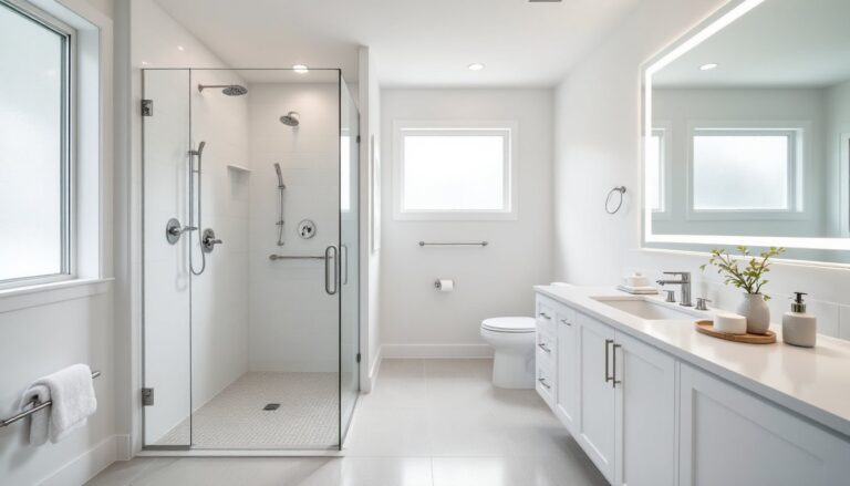
Bathrooms present a unique challenge. Small bathrooms amplify color, and humidity affects paint finish. Use budget home makeover resources for inspiration on moisture-resistant paint choices and finishes (semi-gloss or satin beats flat in humid spaces). A triadic bathroom works best with one bold wall and two neutral ones, keeping triadic colors alive through tiles, towels, and vanity details. Ensure your exhaust fan is sized correctly (CFM requirement = room square footage × 1.5): proper ventilation protects your paint investment from mildew and peeling.
Before you commit to any room, buy sample pots of your three colors and paint large swatches on different walls. Live with them for a few days under natural and artificial light. Colors shift dramatically depending on time of day and bulb temperature, what looks perfect at noon might feel wrong at dusk. This is cheap insurance against a costly repaint.